Monthly Archives: April 2014

1.3.3

Watercolour Practice

PART 1 Making a start

Project 3 Resist techniques

Exercise 3 Techniques

1.3.3.1

Figure 1 (1.3.3.1) Plain area masking fluid on A3 not

1.3.3.2

Figure 2 (1.3.3.2) Textures or patterns masking fluid on A4 not

1.3.3.3

Figure 3 (1.3.3.3) Textures or patterns masking fluid on A4 not

1.3.3.4

Figure 4 (1.3.3.4) Textures or patterns masking fluid on A4 not

1.3.3.5

Figure 5 (1.3.3.5) Line drawing masking fluid on A4 not

For some reason the masking fluid was a bit too strong, and tended to take off the coloured wash when I peeled it off. Looking back on figures 1 to 5 it is probably as a result off the under wash not being dry enough before applying the masking fluid.

While I was doing figures 2, 3 and 4 I noticed that the paint pooled and dried darker when it was trapped on all sides by masking fluid. When I was doing figure 5, I attempted to exploit this by leaving an escape route for the paint in the sky area and the road area while encouraging the paint to pool in the land areas. I am quite pleased with the effect but would have been more pleased if I had allowed the blue under wash to dry more before applying the masking fluid.

1.3.1

Watercolour Practice

PART 1 Making a start

Project 3 Resist techniques

Exercise 1 Reserved shapes from resists

1.3.1.1

Figure 1(1.3.1.1) Cup and saucer wax resist on A4 not

1.3.1.2

Figure 2 (1.3.1.3) Teapot wax resist on A4 not

1.3.1.3

Figure 3 (1.3.1.3) Pattern wax resist on A4 not

I enjoyed doing this exercise but I still think I’m making the whole thing too wet because they are taking a long time to dry.

1.2.3

Watercolour Practice

PART 1 Making a start

Project 2 Laying washes

Exercise 3 Mixed colour washes

I was feeling quite clever by now so I decided to try this exercise using red and yellow on paper that was already wet, alas it seems I did not let the paper dry enough for the first one but seemed to get the hang of it on the second one. I then transfered to a dry sheet of A3 Not and did nine smaller examples which varied in their level of success. Working on this scale seemed to give me more control over the many variables involved.

1.2.3.1

Figure 1 (1.2.3.1) Impatience, watercolour on A4 Not

1.2.3.2

Figure 2 (1.2.3.2) Yellow to red fade, watercolour on A4 Not

1.2.3.3

Figure 3 (1.2.3.3) The nine, watercolour on A3 Not

4.7.4

DRAWING SKILLS

PART 4

Project 7 Self Portrait

Exercise 4 Research point

Investigate some artists self portraits. Look at well known self portraits –such as Rembrandt and Van Gogh and lesser known artists. Make notes in your learning log.

It is easy to find a Rembrandt self portrait on the internet but it is harder to find a Rembrandt self portrait that is a drawing rather than a print or etching, I found only three of these.

Rembrandt Self portrait 1629

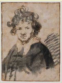
Figure 1 Rembrandt self portrait 1629

Rembrandt self portrait 1633

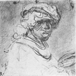
Figure 2 Rembrandt self portrait 1633

Rembrandt Self portrait red chalk

Figure 3 Rembrandt self portrait in red chalk

Both figures 1 and 2 have the strong tonal element that is commonly found in Rembrandt’s sketches but the 1633 drawing has a strong linear structure that would flatten the tonal arrangement were it not for the expressive quality of his line making, you could put this drawing in photo shop and remove the tones without losing the sense of volume and space that the portrait conveys. Look at how the swirling lines representing the collar snake about each other and fade. The hair is a mastery of linear recession.

The earlier drawing appears to have been done before Rembrandt achieved his mastery of light and shade that were the hallmark of his later career as is evident in figure 3.

Similarly with Van Gogh there is a wealth of painted self portraits in the internet but I found only three that were drawings.

Van Gogh Self portrait 1886

Figure 4 Van Gogh self portrait 1886

Van Gogh Self portrait 1896

Figure 5 Van Gogh self portrait 1896

Van Gogh the artist as seen by himself

Figure 6 Van Gogh The artist as seen by himself

In the 1886 portrait you can see and feel Van Gogh’s struggle to find the line whereas in the 1996 version the line is much more assured and free flowing I would guess that this is a drawing of one of his painted self portraits. The third drawing is, perhaps the most interesting, although the linear element is still strong the tonal values give it much more of a sculptural quality reminiscent of his early work before he found his lightness of touch.

The term “lesser known artists” in the question does indeed give a wide variety of scope, I have chosen to interpret it as “lesser known self portraitists”

Courbet Self portrait with smoking pipe

Figure 7 Courbet self portrait with a smoking pipe

This is one of my favourite self portraits, I love the sculptural quality of it, and the way that your eye   wants to see more of Courbet’s eyes that are surrounded in deep shadow.

Cezanne portrait of the artist

Figure 8 Cezanne self portrait

Even with his own self portrait, Cezanne could be drawing an apple, it isn’t the subject but the marks on the paper that seem important to him.

4.4.1

DRAWING SKILLS

PART 4

Project 4 Structure

Exercise 1 Research Point

Look at anatomy books, or do a web search for anatomy images and see what you can find. Make notes on how you can use this information to improve your figure drawing. Try to do an anatomical drawing yourself.

DSC_0054

Figure 1 (4.4.1.1) Pen and ink on A3 pastel paper

4.6.4

DRAWING SKILLS

PART 4

Project 6 The moving figure

Exercise 4 Check and log

How well did you manage to create the sense of a fleeting moment rather than a pose?

The only sketch in my sketchbook where the model posed is the one of my granddaughter who readily agreed to pose but has the patience of a three year old and didn’t do so for very long. I think I have managed to capture the sense of fleeting moments in my figure sketches and hopefully I am beginning to introduce this sense of immediacy into my drawings

How successful were your attempts to retain an image and draw later?

The sketches at the back of the sketchbook are the ones I drew from memory and I’ve found that as my knowledge of anatomy and figure drawing has improved so too have my sketches from memory.

Were you able to keep to a few descriptive lines to suggest the person’s movement or were you tempted to keep introducing more elements into your work?

I think all of my figure sketches are done with as few lines as possible to give a sense of what I am seeing all of them were quite hurried and mostly they are really just smoky impressions of figures. I think you can tell from looking at them where they were done and what the figures in them are up to.