Monthly Archives: July 2014

5.4.1

DRAWING SKILLS

Part 5

Option 4

Exercise 1 Quick studies

DSC_0001

Figure 1 (5.4.1.1) 10 min study graphite on A2 cartridge

DSC_0005 

Figure 2 (5.4.1.2) 10 min study graphite on A2 cartridge

DSC_0008

Figure 3 (5.4.1.3) 10 min study graphite on A2

DSC_0014

Figure 4 (5.4.1.4) 10 min study graphite on A2 cartridge

 DSC_0017

Figure 5 (5.4.1.5) 10 min study graphite on A2 cartridge

 DSC_0021

Figure 6 (5.4.1.6) 10 min study graphite on A2 cartridge

DSC_0023

Figure 8 (5.4.1.7) 5 min study graphite on A2 cartridge

DSC_0025

Figure 9 (5.4.1.8) 5 min study graphite on A2 cartridge

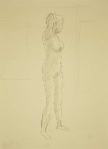
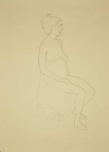
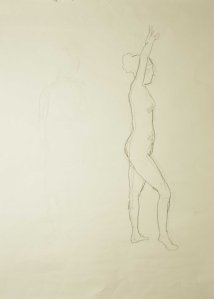
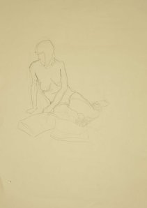
These drawings have all been done since I completed part 4 of the course. After I finished part 4 I studied a course in anatomy. This has given me I think less fear in approaching the short studies and a greater sense of proportion and form. This has I think made my quick studies more alive  and less stiff. My favourite one is figure 5 which seems to bring out the tension of the models body in the pose.

Assignment 1

Watercolour Practice

PART 1 Making a start

Assignment 1


I started off with the watercolour sketch from my Sketch book; my choice was a bit limited owing to the recent spell of dreadful weather.

1 Sketch

Figure 1 (A1.1) Original watercolour sketch done on location 150 x 125mm

I was pleased with the sketch and I liked the loose feeling to it, but felt it lacked a bit of something and seemed a bit unbalanced. I thought about it for a while, and eventually I did a bit of redesign on a sheet of A3 in graphite, toying with ideas on how I thought it could be made to look better.

The house was too central in the sketch and I decided to move it so the bright gable was on the thirds, but this left a big empty quarter on the right hand side so I added a tree to balance the houses and to stop your eye drifting off the page on the right. I also got rid of the telegraph poles and streetlights as I felt they were a bit dominant and removing them would make my painting less contemporary. When I was fairly sure this was the way to go I did a couple of thumb nails to check on the tones and guess at an eye path in the finished picture.

2 Notes

Figure 2 (A1 .2) Experiments with composition and tone, graphite on A3 cartridge

Then I started with the preliminary watercolour study at A3 size. I didn’t do any preliminary drawing and I wet the sky area with clean water and waited while the sheen went off it and applied a plain ultramarine wash for the sky blotting out the cloud shapes as it dried. I painted the landscape from back to front and although I didn’t use any unusual brushes I used a whole variety of brush marks especially in the trees and bushes, I was pleased with the effect of these marks as the reminded me somewhat of the old railway posters done in an art deco style.

I took a photograph of the study and produced a 2 tone notan in Photoshop and a ten tone black and white version as well both at A4 size and hung all three on the studio wall so I could get used to them and think about changes and improvements.

What went Right:

  • I was well pleased with the Notan and the spread of tones.
  • The trees and bushes.
  • The pretty colours.
  • The composition.

3 trial

Figure 3 (A1.3) Preliminary watercolour study A3 not

3 trial a 2

Figure 4 (A1.4) 2 tone notan A4 photocopy paper

3 trial a 10

Figure 5 (A1.5) tonal print 10 tones A4 photocopy paper


What went wrong:

  • The stripy sky
  • The initial sky wash was too pale and I had to add another wash above the stripy clouds to darken the top of the sky, good job the sky was stripy really.
  • I brought the initial sky wash over the building gable. It took ages dampening it down to blot it off.
  • There are just too many colours in there
  • The shadow value on the side of the cottage is too pale and too purple.
  • The brown roof just does not go

Back to the painting board to produce this

4 Final

Figure 6 (A1.6) Final piece Colney heath watercolour on A3 not

I drew in the roof line in light pencil to avoid the problem with the gable that I had before and I limited my palette to four colours, ultramarine blue, light red raw sienna and lemon yellow and used a tonally graduated wash in the sky. The clouds are much less stripy and more natural looking due mainly to adding a bit of dirty colour to the undersides. Working with a limited palette has drawn the thing together and eliminated the garish purple but looking back it has lost too much of the looseness of the original sketch which is alas a tonal nightmare (you will have to squint to see it)which means I must pay more attention to the tones when working outside.

4 Final a 2

Figure 7 (A 1.7) 2 tone notan A4 photocopy paper

4 Final a 10

Figure 8 (A1.8) tonal print 10 tones A4 photocopy paper


Another week chasing the dream

Well this week i got a little closer. I read a half of Carlson’s guide to landscape painting and the whole of Hawthorne on painting. I went to an exhibition where one of my paintings was an exhibit, it’s in my gallery, it’s called the Lightning tree.

I watched the BBC series of ” The Impressionists” and I went to Life class on Monday and Tuesday night. The learning was Hhgh but the productivity was low.

5.4.3.1 Research point

DRAWING SKILLS

Part 5

Option 4

Exercise 3 Research point

Ingres

Ingres was perhaps the last of the great classical artists ,as a young man he spent a short time in David’s studios and was influenced by the drawings of the little known English artist John Flaxman (1755 -1826) who would later go on to achieve fame as the designer of the classical Jasperware for Sir Josiah Wedgewood.

Ingres’ drawings are line and not mass drawings they are not transformed from nature but are deliberately abstracted into a contour line and the main lines of the construction. This is precisely the information that Ingres required to carry out his academic paintings which are essentially coloured drawings built up in glazes.

The modelling in the drawings is completely suppressed Ingres was drawing the forms, there are no cast shadows even the heads in the drawings, which generally contain the darkest marks, Ingres was drawing the forms and not the light and shade he could see before him.

In the opinion of Pierre Rosenberg Ingres used his drawings as a self teaching aid to perfect his skills and whilst this may be true there is much evidence to show that Ingres would redraw a drawing in a slightly different position to improve the composition prior to commencing a painting. There is more modelling in Ingres’ paintings than in his pure line drawing, but there is still a dominance of line over shading. The lines that define Ingres’ painted forms are superior to the modelling.

Ingres instils the form in his drawings by two means, the first is by line weight Ingres uses a great variety of different line weights. Notice how the undersides of things in his drawings are bounded by a heavier line indicating that these are in shadow. A similar detail can be observed at folds in materials that are also in shadow. What modelling Ingres does carry out is done with soft shading probably done with the side of the pencil so as not to break up his large forms and turn his drawings from line drawings into mass drawings. This can readily be seen in the garments of Ingres drawings. Where sections of the clothing are in the light Ingres would use a soft contour almost as a lost edge.

Ingres Madame Victor Baltard

Figure 1 (5.4.3 1) Ingres; Madame Victor Baltard. Note the subtle weighting and overlapping of line to achieve form in the cape and dress

The second technique Ingres used is to draw in short overlapping lines so that his contour lines were constantly cutting into his forms giving a stepped effect forcing parts of the form in front or behind each other. As in the first technique this enabled Ingres to show the modelling without resorting to shading which would clutter up the large forms in his line drawings.

Ingres drawings are in pencil and pencil works best as a line medium, Ingres used his skill in line work to express form that would more usually be carried out by shading.

Ingres La grande odalisque

Figure 2 (5.4.3.2) Ingres; La Grande Odalsque. the literal translation from the French is “woman with a long snakelike back”

Much is made these days of the exaggerated proportions in Ingres drawings and paintings. A classic example is the size of Julia’s arm in the drawing “The Forestier Family”. While such an error would have been corrected by Ingres prior to painting it is interesting to compare it to the back of “La Grande Odalisque where there appears to be more vertebrae than your average snake. Such distortion was probably carried out by Ingres for design purposes and unless such distortions is pointed out it is possible to look at “La Grande Odalisque” as a perfectly believable form, the beauty of the painting as a whole subjugates the anatomical error.

ingres 1 the forestier family 1806

Figure 3 (5.4.3.3) Ingres; The Forestier Family. Ingres has captured Julia in her transformation into Octogirl, an early, little known, 19th century super hero.

Another problem with “The Forestier Family” is the inconsistency of the light source, this is probably because the drawing is an amalgam of separate portraits of the various members of the family.

Hockney in his theories as to the use of the camera Lucida by various artists concluded that Ingres used a camera Lucida for the clothing and then drew the heads from direct observation. It is probably the greatest good fortune that Mr Hockney earns his living as an artist rather than a scientist.

The additional finish to the faces in the drawings probably date from Ingres’ time earning his living drawing portraits of the great and the good doing the European tour when the faces had to be instantly recognisable to obtain payment. Take a trip to watch portrait artists at work in the cities today to observe this phenomenon.

Ingres’ heads despite appearing to be the more finished parts of his drawings are devoid of shading, Ingres achieves the modelling by careful positioning of the features and your brain fills in the missing bits.

By way of contrast to al this linear work there is an Ingres drawn head that has mush mure tonal work in it than one would normally associate with Ingres, this is the study for Vicomtesse Hausonville. Ingres seamed dissatisfied with the position of the Vicomtesse’s hand in the original sketch perhaps as he developed the design of the painting. The study was probably done in his studio as he painted the portrait. This is Ingres in paint mode which would probably account for the tonal work in the study, Below are the sketch, the Study and the finished painting I for one, perhaps two if you count Ingres, prefer the second version of the hand that was developed in the study.

Ingres  sketch for Vivotesse Hausonville

Figure 4 (5.4.3.4) Ingres; Sketch for Vicomtesse. Ingres must have had his doubts about the position about the left hand from the beginning because of the heavy marks between the forefinger and chin, most unusual in an Ingres sketch.

Ingres Study for Vicomtesse Hausonville

Figure 5 (5.4.3.5) Ingres; Study for Vicomtesse Hausonville. Note the much more elegant arrangement of the left hand and the tonal work beneath her chin that transfers directly to the painting forcing the chin in front of the neck

Vicomtesse Hausonville

Figure 6 (5.4.3.6) Ingres; Detail from Vicomtesse Hausonville. The painting that we all love and know of the good Vicomtesse with her ever so elegant left hand. Notice how the modeling in the painting is not as important as the line, why this could almost be a Jasperware portrait of the Vicomtesse.
Non break

Well it has been a while but I have been ever so busy,with this and that. My tutor wasn’t too pleased with my assignment pieces for part four of the Drawing 1 course so I have spent a couple of months rectifying What I perceived to be the problem. I spent a good bit of time learning about anatomy, and a little more time, more than I actually intended mining in the data mines.

I was researching Ingres in the internet and I discoved by accident, as you are want to do whenyou are doing this kind of research on line one Stapleton Kearns,, an American landscape painter who paints a mean landscape but who is also a font of knowledge. I spent 6 weeks checking out Stapleton’s back blog and learned much in the process.

Now I am back on the horse. I had a minor diversion painting thew lightening tree for the art society exhibition, I have posted this picture in my gallery cause I am a bit proud of it see you can’t keep the swagger down.